When it comes to building a standout brand, every single detail counts. From your color palette to your product packaging, everything speaks to your audience. But there is one foundational element that often flies under the radar, acting as the ultimate unsung hero of your visual strategy: typography.
The fonts a company chooses can completely make or break its brand perception. Think about the bold, dynamic letters of Nike that practically radiate energy, or the elegant, timeless typeface of Chanel that instantly whispers luxury. Typography isn’t just about picking letters that look pretty on a page or a box; it is the visual wardrobe of your brand. Your fonts can be formal, casual, playful, or serious—and just like a perfectly tailored suit, the right font makes a killer first impression.
At BoxesPackage, we know that great typography doesn’t just live on a digital screen. It comes to life when it is physically printed on your custom shipping cartons, product boxes, and mailers. In this article, we’ll dive deep into how top global brands leverage typography to craft their iconic images, how different industries use fonts to communicate value, and how you can choose the perfect typeface to elevate your custom packaging.
How Top Brands Across Industries Use Typography
To understand the sheer power of a font, let’s look at how the world’s most successful companies use typography to establish their domain:
1. The Luxury and Fashion Sectors
High-end fashion brands rely heavily on typefaces that exude heritage, prestige, and sophistication.
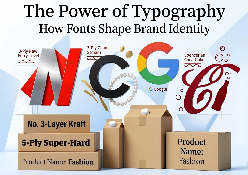
- Chanel: Epitomizing timeless elegance, Chanel uses a custom serif typeface for its logo that screams luxury. For body text, they often pair it with Futura, a geometric sans-serif font that seamlessly balances modernity with class.
- Gucci & Louis Vuitton: Both luxury powerhouses utilize bold, custom serif fonts that radiate tradition and high-end luxury, making their brands instantly recognizable worldwide.
- Prada & Versace: Prada opts for a sleek, modern serif font that reflects minimalist high fashion, while Versace employs a classic, ornate serif font to evoke a sense of opulence.
2. The Sportswear Industry
In sports and fitness, typography needs to move. It must reflect athletic prowess, strength, and raw energy.
- Nike: To convey power and relentless movement, Nike employs a custom sans-serif logo font that is bold, slightly condensed, and visually heavy.
- Adidas: Emphasizes simplicity and modernity by using a clean, sans-serif font called ITC Avant Garde Gothic.
- Puma & Under Armour: Puma uses a sleek, italicized sans-serif font to explicitly communicate speed and agility, while Under Armour utilizes a sturdy, bold sans-serif font that embodies physical strength.
3. The Tech Giants
Technology companies lean heavily into minimalist aesthetics to represent cutting-edge innovation, user-friendliness, and simplicity.
- Apple: Apple’s sleek, modern San Francisco font perfectly mirrors the brand’s minimalist ethos, used uniformly across all devices and marketing.
- Google: Conversely, Google’s custom sans-serif font, Product Sans, is engineered to be friendly, clean, and approachable.
- Samsung & Sony: Both utilize crisp, clean sans-serif typefaces that emphasize reliability, precision, and state-of-the-art engineering.
4. Food, Beverage, and Apparel
These everyday consumer goods industries use fonts to evoke comfort, nostalgia, or rugged durability.
- Coca-Cola: A legendary example of script typography. Its nostalgic Spencerian script has been an iconic staple of comfort and familiarity since the late 19th century.
- Starbucks: Uses a custom, hand-drawn font called Freight Sans Black for its logo to convey a casual, warm, and approachable neighborhood coffee shop feel.
- Levi’s & Wrangler: Levi’s uses a bold, condensed sans-serif font representing rugged American style, while Wrangler utilizes a heavy slab-serif font that highlights its durable, tough clothing.
Industry Decoded: The Psychology Behind Font Families
Why do these choices work so well? It all comes down to font psychology. Different font families trigger distinct emotional responses in consumers:
- Serif Fonts (Tradition & Luxury): Characterized by the small decorative feet at the ends of the letter strokes. They are heavily favored by fashion and cosmetic brands (like Estée Lauder or Chanel) because they convey history, class, trust, and premium quality.
- Sans-Serif Fonts (Modernity & Innovation): Modern fonts without the decorative feet. They are clean, highly legible, and versatile. Tech brands (Apple, Samsung) and trendy cosmetics (MAC, Sephora) use them to look sleek, forward-thinking, and fast-paced.
- Script and Hand-Drawn Fonts (Creativity & Comfort): These fonts feel human. Whether it’s the playful vibe of Ben & Jerry’s or the nostalgic look of Coca-Cola, these fonts build an immediate emotional bond of warmth and fun with the consumer.
Bringing Typography to Life on Your Custom Packaging
At BoxesPackage, we firmly believe that your brand story shouldn’t stop at the checkout screen. When a customer receives their order, your shipping carton or product box is the very first physical touchpoint they interact with. If your digital branding screams luxury but your physical packaging features generic, poorly printed text, the consumer experience breaks down.
When designing your custom boxes with BoxesPackage, keeping typography at the forefront of your packaging design is essential:
1. Match Your Structural Packaging to Your Font Personality
If you are ordering our heavy-duty, industrial-grade 5-layer corrugated shipping cartons for rugged goods, pair them with bold, sturdy sans-serif or slab-serif typography that reinforces strength and durability. If you are designing high-end, minimalist gift boxes, choose crisp, elegant serifs or clean geometric lines that match a luxury aesthetic.
2. Prioritize Print Legibility and Scale
A font that looks crisp on a backlit iPhone screen might look muddy if printed too small on corrugated kraft paper. Our design experts at BoxesPackage always recommend checking font weights. Ensure your brand name, handling instructions, and social media handles are bold and clear enough to withstand the high-speed printing processes used on industrial packaging.
3. Maintain Complete Brand Consistency
Consistency is the absolute key to professional branding. The fonts used on your website, your social media graphics, and your physical BoxesPackage shipping cartons must create a cohesive look. When a customer sees your distinctive typography on a delivery truck or a doorstep, they should instantly recognize it as yours.
Conclusion: Elevate Your Brand with the Perfect Font
Typography is far more than just ink on cardboard; it is a powerful psychological tool that molds how your business is perceived by the world. By learning from global leaders like Nike, Apple, and Chanel, you can make savvy typeface choices that align with your core values and resonate deeply with your target demographic.
Whether you are an ambitious e-commerce startup, a marketing professional, or an established business owner, picking the right font will supercharge your brand image. Ready to see your brand’s unique typography beautifully crafted onto premium, high-strength shipping cartons? Contact the packaging and printing specialists at BoxesPackage today, and let’s co-create an unboxing experience your customers will never forget!